Root potential
Founded in 1953 as a sugar beet cooperative bank, Şekerbank has forged a niche as a people’s bank with a focus on the community and the small and medium enterprises (SME) market in Turkey.
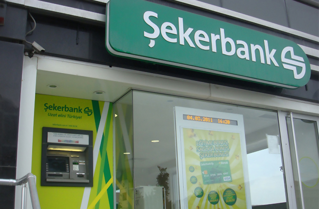
Recognising the critical role branch design plays in shaping a retail bank’s brand, Şekerbank appointed us to create new exterior and interior concept designs for a fit-out and refurbishment project. How could we build on its reputation with a branch design to attract higher worth customers in urban areas without losing sight of Şekerbank’s rural community heritage?
Working alongside a local, Istanbul-based architectural design practice Toner Architects, we explored strategic opportunities to differentiate Şekerbank from its competitors and thereby help the bank establish stronger street visibility and presence.
Dignified, differentiating and dynamic
After reviewing the brand’s colour palette against a range of criteria, we concluded that the existing green’s potential was not being maximised externally. Building on the equities of green, we proposed a subtle tweak to the corporate palette; a new lime colour was introduced which fits with Şekerbank heritage but also adds a differentiating and contemporary context. From a retail perspective, the colour works powerfully both by day and by night. As a literal expression of growth, the colour is also good at communicating across large areas such as brochures, poster and interiors.

Grassroots thinking
Şekerbank sits in the middle territory between traditional and modern with untapped potential to communicate a customer-friendly image. The dominant brand colour was deemed to be too dark and unsophisticated for the retail interior, whilst the neutral beige colour lacks character and personality.
Amplifying better things
Gone are the dark green stripes, boring (and outdated) beige and emphatic use of the corporate symbol that does nothing to promote a modern, people-centred brand and in comes a lime green, timber wood effect and an efficient grey to complete the look of a modern (city) bank destination.
Interior decorative graphic treatments including a ‘growth’ texture and graphic were created for application across a variety of internal wall areas including meeting rooms (sales zones), touchdowns, quiet areas (dwell zones), and cashier area (transaction zone). A key challenge was to make interior branded areas more conducive to interactions (not just transactions) by creating a friendly yet professional ambience.

Therefore messaging incorporated across designated zones is differentiated to promote purposeful interactions. For example placing promotional messages in the sales zones, reassuring corporate message in the transaction zone and neutral, dignified message for dwell zones.

Concept designs were also provided for branded communication materials, exterior retail window display, ATM and other vinyl message applications for example telephone/internet banking.
A modern and friendly retail destination
Building on existing equities, the refreshed design has been successfully implemented across its entire network. Şekerbank is now ranked sixth among the world’s 50 fastest growing banks in The Top 1000 World Banks survey conducted by The Banker Magazine, a leading international finance publication. The visibility of the new branding and enhanced retail design has surely played a significant role in its growth strategy and achievements to date.