The sum of its parts
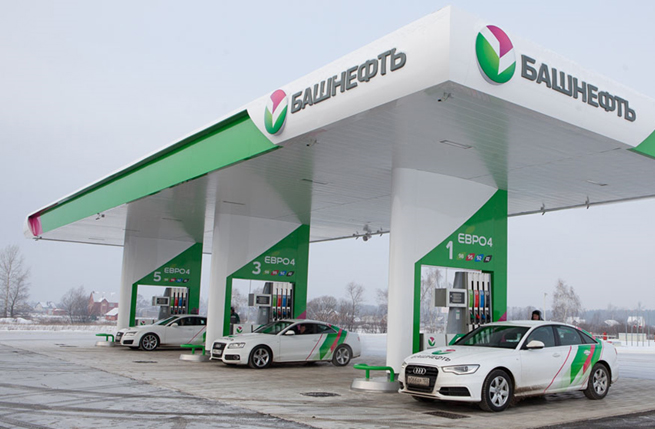
When Bashneft was acquired by the investment company Sistema in 2009 it was clear there were opportunities to rationalise the network of 500 petrol stations which were branded under an assortment of names and in various states of repair located over a large swathes of middle Russia.
Reorganisation and consolidation of its subsidiaries meant that the brands had to be firstly united under one single refreshed brand symbol.
All under one roof
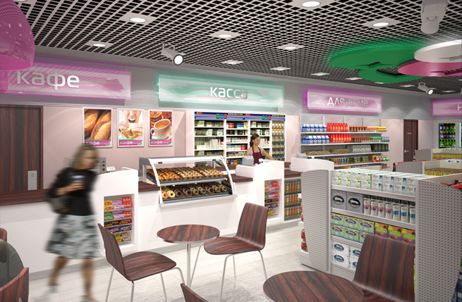
Secondly, Minale Tattersfield were appointed to create the retail identity and architecture including a brand new convenience store. The challenge was to not only create a visual look that could be consistently applied across Bashneft's entire network but also to differentiate the food from the fuel offer. As part of the re-imaging work, Minale Tattersfield was presented with an opportunity to advance the c-store format to create a more appealing in-store café ambience.


Differentiating the c-store offer
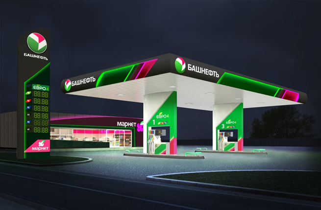
The new logo is an evolution over the old and provided the angular aesthetic for the graphics. The reapplication of decorative elements (colours, gradients, lines, angles) across the entire design reinforces brand recognition and its symbolic strengths.
The use of the colour magenta (mostly for the shop) is a first within the fuel retail industry. Together with a saturated mid-green and a white as neutral anchor, the design clearly sets itself apart from its competition, especially when juxtaposed against a wintery white landscape.

The c
-store design differentiates the food from the fuel offer by inverting the ratio of magenta to green fill across the shop and other forecourt elements. It also capitalises on the magenta colour in Bashneft’s corporate logo, with a berry motif to symbiotically link the food offer to naturally found flora in the regions in which Bashneft is most visible.
LED lighting was used throughout for its longevity and low energy consumption characteristics and gave the opportunity to add a dynamic lighting effect on the canopy, lending it greater visual impact.
Result
The subtle interplay of the more curvilinear architecture neatly produces a modern retail statement that is both customer friendly and practical to build by local contractors.