Pumping up the offer
Russia’s Gazprom is the world’s largest gas producer and has a vast portfolio of oil and non-oil related businesses but prior to 2008 there was no recognized petrol station offer.
Gazprom Neft, the oil-producing subsidiary of Gazprom, was tasked with establishing a network of branded petrol stations and commissioned Minale Tattersfield to realize its ambition.
Looking to rapidly gain market share, Gazprom Neft has acquired several existing networks in addition to commissioning a number of new petrol stations. Their brief to Minale Tattersfield was to re-brand the company in order to unify the new build and retrofit outlets and to affirm the core message of the brand.
Maintaining brand equity across international markets
At home, Gazprom is widely and deeply respected, representing strength, solidity and national pride. However, outside Russia a different picture emerges. In research, it was found that non-Russians were suspicious and afraid of this huge, powerful company. So the brief became clear: to preserve the existing brand equity for the home market while introducing a more consumer-friendly, softer appeal for new international markets.
Secondary branding first
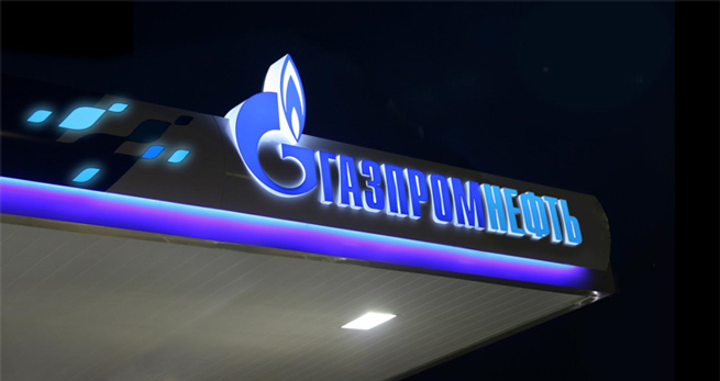
The company was reluctant to change the visual manifestation of the brand, especially the iconic“G”, but recognised the need to soften Gazprom’s image. We designed a stylised flame as a secondary branding device to add a welcoming appeal to the logo while selectively introducing a lighter shades of blue and white for clearer definition.
A model of good design
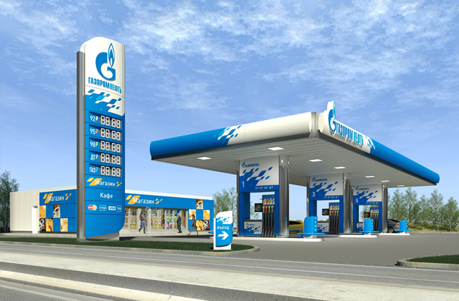
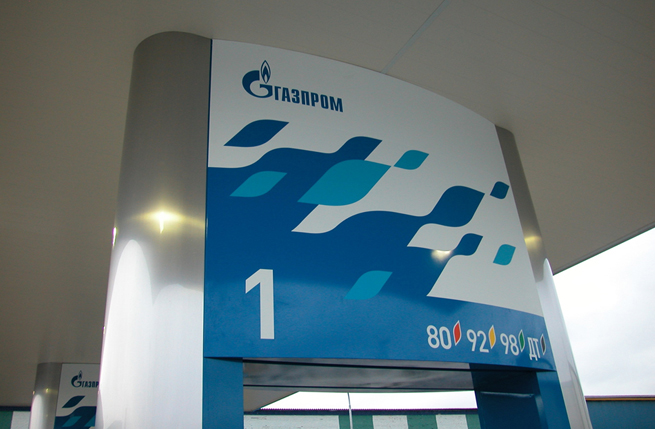
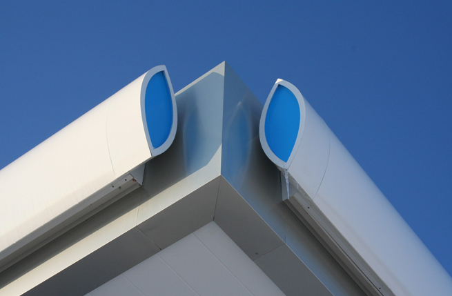
Due to the size of Russia, all our design proposals addressed the problem of logistics. Modular construction for spreaders, column cladding, totem and canopy made implementation easy.
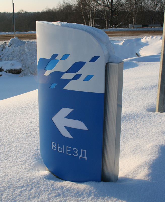
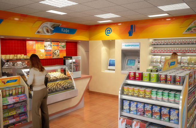
We recommended LED lighting for the canopy illumination, lasting the lifetime of the fit-out and more reliable in the severe cold. The convenience store is signalled by aluminium cladding, which flags up the food offer on yellow panels, differentiating it clearly from fuel products.
As the food offer is a strong draw for the convenience store customer, it is important to keep this visually distinct from the fuel offer. Welcoming shades of orange were selected for the shop, which created a promise of warmth when seen from the forecourt. The corporate blue colour was used for internal signage and wayfinding material, maintaining the visual link with the Gazprom brand.
Significant sales growth
According to Gazprom Neft, average volume of fuel product sales per filling station has increased as much as 40% to 14.2 tonnes a day since 2009 and time-wise this correlates with the rollout of the new branding and completion of upgrades across its network of 1670 filling stations.