Background
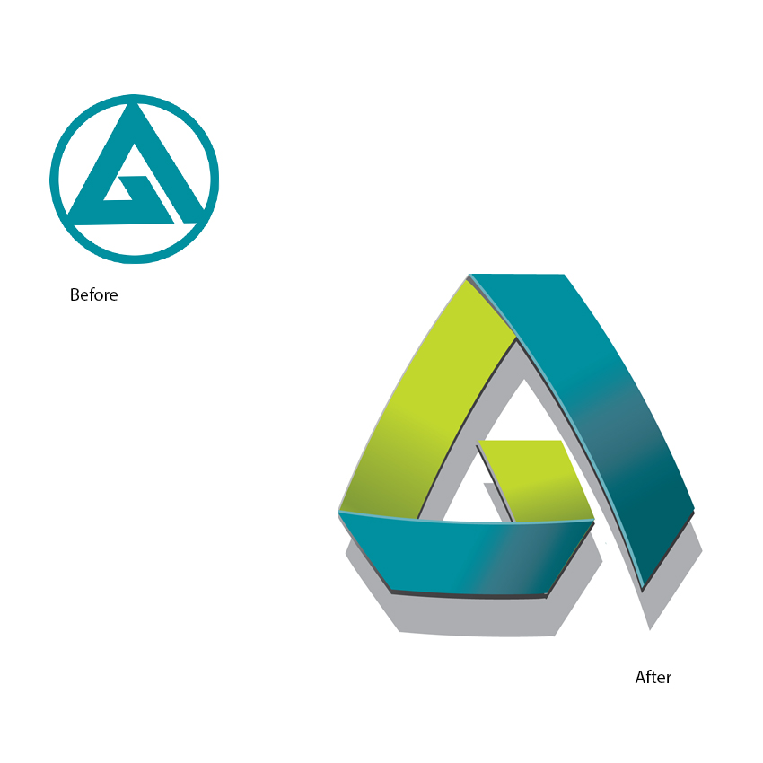
Alliance is a leading Russian fuel brand with a sizeable network in the Far East of Russia. The Alliance visual identity centred around an A logo, the name, and the colour turquoise.
Whilst such a simple palette of components allowed Alliance to achieve consistency, it appeared lacklustre compared to their competitor Rosneft. Alliance appointed Minale Tattersfield in 2010 to refresh the brand so it would be more competitive in the retail sector and reflect the more mature sophisticated nature of the company as a whole.


A stronger customer facing look
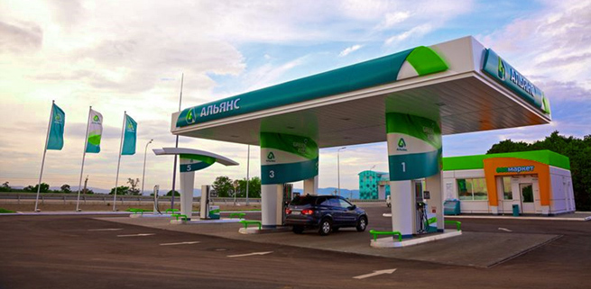
Whilst Alliance is considered a leader in that part of the world, market research suggested the brand was in danger of slipping behind the brightly coloured competitor gas stations. Minale Tattersfield was handed responsibility for creating a new corporate and retail identity for the Russian fuel retailer with the first part of the brief to present the Alliance identity in a more engaging and contemporary manner.
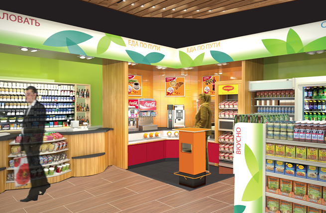
C-store that spells customer friendly
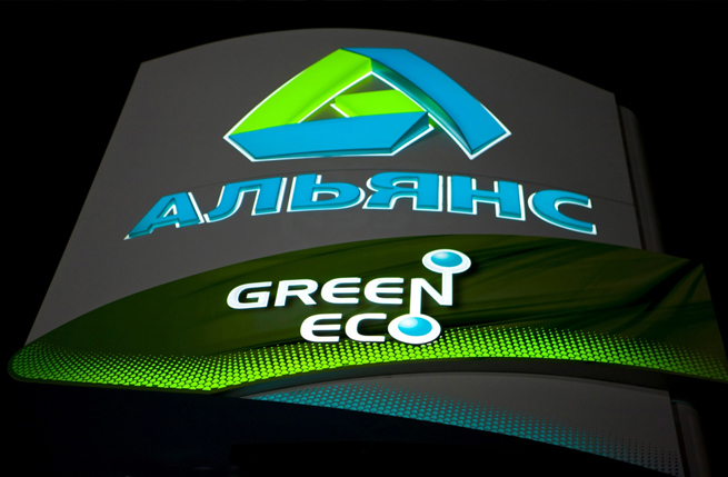
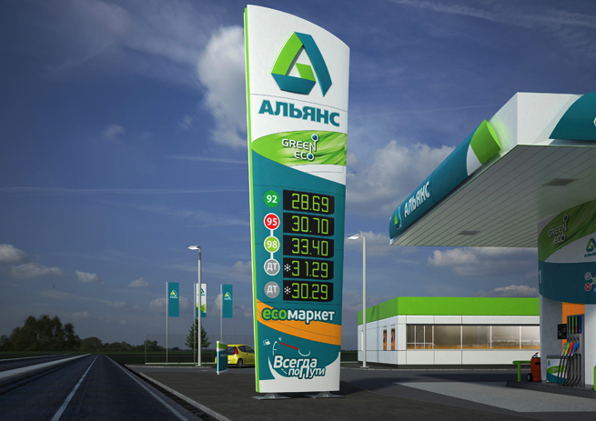
This design decision allowed the introduction of a second colour, a bright green, which not only lifts the main turquoise colour, incidentally referred to as green amongst customers, but also reinforces Alliance’s green colour statement. The Alliance premium fuel brand is also called Green Eco and the name now sits comfortably on the bright green ribbon texture, located above the pumps and below the logo on the totem.
Steady growth
So far trade has been encouraging and the incremental improvement in ROI has resulted in Alliance converting more gas stations with this new design over the coming months.