Background
Considerable corporate muscle plus a wholesale refresh of the brand was required to propel Rosneft from a middleweight state controlled oil company on the Russian stage to a giant on the world stage in the space of 10 years.
Starting in 2006 and continuing through to the launch of the Sochi 2014 Olympic stations, Minale Tattersfield’s task was to reposition Rosneft as a contemporary, mass to premium brand that crucially could be described as a paragon of Russia’s modernization and state prowess.
For a brighter future
When Rosneft, a major petrol retailer in Russia, carried out qualitative research in the market, they were faced with an interesting question from consumers: “How come you're so dull when your visual identity is yellow?” Nobody’s happy to be called dull, not even a petrol retailer. Commercially, this means you’re not operating to your full potential.
Anxious not to lose market share, the Rosneft management contacted us. They knew that we had enormous expertise in the energy sector and had worked with some of the biggest petrol retailers in the world. We were appointed after a competitive pitch to propose a strategic creative solution.
Focusing on the customer
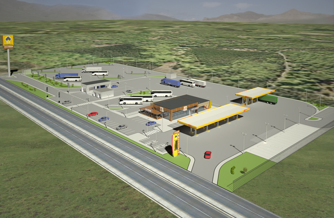
After Rosneft acquired Yukos, the senior executives knew they had to re-brand their retail sites. Here was an opportunity not only to expand their network, but also to revitalise and modernise their brand identity as well.
Having performed poorly against competitors such as Lukoil and BP, there was scope to become a more customer-focused, welcoming and modern brand. This would pave the way to strengthening their position in the mid-market. They wanted to be seen as more prestigious by consumers and they needed more confidence from corporate investors.
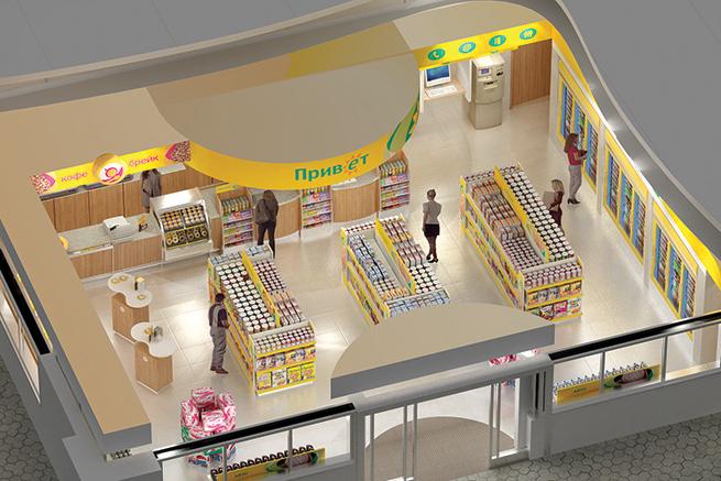
Visible improvement
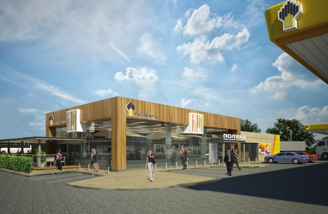
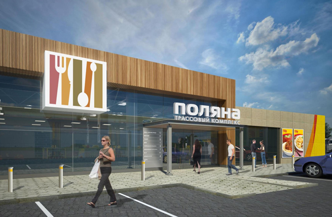
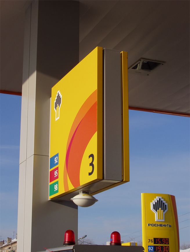
Despite the fact that Rosneft was a relatively young company, we understood that the company’s logo symbol was well established. Rather than choosing to eliminate this key element, we looked at other features which helped define the brand. The colours. The shapes. The consistency.
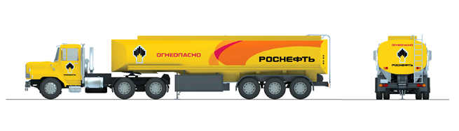
As colour is the single most important design factor in the petrol retailing environment, we looked at the particular shade of yellow Rosneft were using. We looked at the white, and the black.
There was an opportunity to make these colours work harder to communicate the warmth it needed. We made the yellow more saturated, so it would appear fresher and not so cold. We replaced the white with silver, which looked more modern and didn’t get so dirty and tired-looking. We restricted the use of black which can introduce negative associations when used in the energy sector.
Where there had been straight lines, we introduced the orange “swoosh” as a secondary branding device. This again introduced warmth and vitality to the brand.
have the power
Rosneft have implemented the re-designs for their petrol retailing sites in over 1000 locations. As well as giving Rosneft a strong and strategically important retail identity, the designs have also been applied to the Rosneft corporate identity. This appears on the company’s stationery, website, tanker livery and all business to business communication.

The brand manual we produced forms the basis of a consistent and powerful Retail Visual Identity, while the profitability of both its core fuel business and its ancillary services such as the convenience store network has grown year on year.

Testimonial
“The new Minale Tattersfield designed petrol stations and convenience stores have raised standards within the Russian market.”