Background
EKA was a dealer and operator of a small network of petrol stations in Moscow. In 2010 a strategic about-turn by the major Russian fuel retail brands resulted in EKA losing their franchise agreements.
EKA were faced with the options to cave in and sell or the more ambitious but risky route to create their own brand from scratch. EKA chose the latter and appointed Minale Tattersfield as their agency. EKA agreed that the most appropriate brand strategy was to boldly position themselves as a niche destination brand more able to adapt to market changes with an emphasis on non-fuel, something the competitor major brands were less able to do.
Niche destination brand
Russian fuel retailer EKA was founded in 1997 and today it manages a small network of 58 filling stations within Moscow and its vicinity. With just 8% market share of the total gas stations in Moscow how could Minale Tattersfield help EKA build brand visibility in a landscape dominated by the big three? One thing was for certain, the niche player needed a striking new visual identity and branding solution to compete effectively.


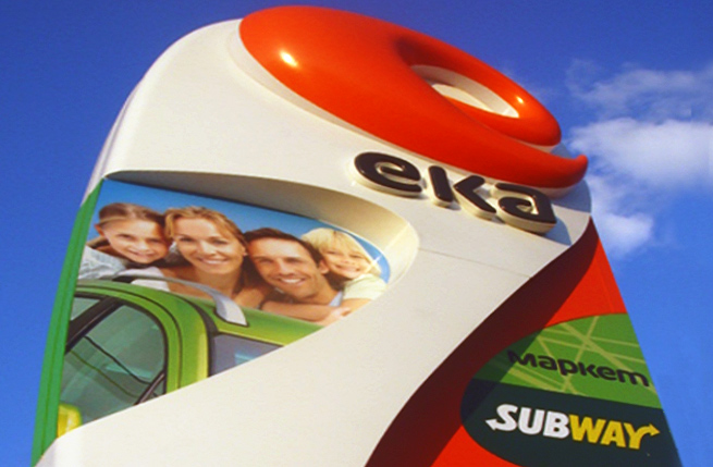
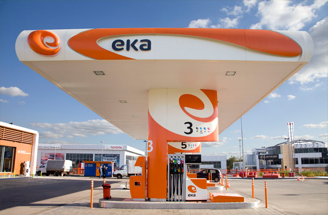
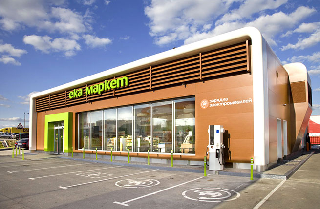
To raise EKA's visibility and memorability amongst upwardly mobile Moscovites, a striking new orange colour was adopted for its logo identity, the kind that is not represented in any of the competitor retail networks. The choice of colour was also used across Eka’s external forecourt, carwash, c-store building and interior.
The letterforms of EKA are quite hard and directional and lend themselves to swirly symbol going up and down or across. The designers considered a way to give the logotype more impact and fluidity and felt a natural progression would be to make the forward-leaning E symbol multi-dimensional. In doing so, this would help to strengthen the brand's symbiotic association with automotive speed and power.
Eye catching
Evidence suggests that the first 3-5 seconds on approaching a forecourt is critical in positively shaping motorists' refueling and shopping behaviour.
Predictive research incorporating 3M Visual Attention Service (VAS) was adopted to test the effectiveness and comparative strength of branded signage elements (totem, canopy, pump island forecourt, etc) against other points of interest across the motorist’s line of vision.
VAS proved particularly worthwhile in the case of EKA as a comparatively high level of investment in network upgrade and tight project deadline necessitated an empirically proven design approach.
Environmentally-friendly
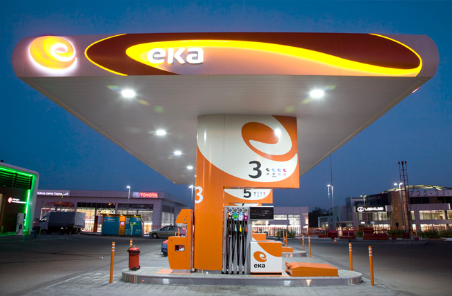
The dramatic look is accentuated with low maintenance energy-conserving LEDs to illuminate the forecourt and accentuate the curvilinear design and swirl of the logotype.
Like all capital cities a 24/7 environment is an important roadside retail consideration, but nowhere more so than in Moscow, a city that never sleeps.
As well as energy efficient lighting the prototype site that Minale Tattersfield worked on would become the first petrol station to offer rapid EV charging infrastructure, and waste recycling.
Best station of the year
The design is catching on and plans are already underway to expand the network with construction in Domodedovo and Krasnogorsk areas of Moscow. Overall cost of the project is in the region of 2.5 to 3 million rubles with a pay-off in 6 to 8 years.
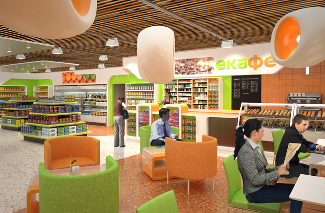
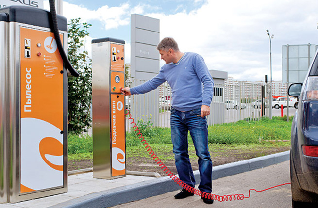
The corporate identity is being applied to 17 retrofits and three new stations over a three year period and will see the company ramp up its related business activities (car cleaning, shops, cafes, ATMs). With increased footfall, higher consumer spend, the brand has been also been bolstered by being named Best Station of the Year by Modern Gas Station Современная АЗС.