Our Moscow office won the project to design a graphic identity for Moscow to promote the city as a tourist destination abroad. For a major European capital at the intersection with Asia, Moscow has a young demographic profile and dynamic cosmopolitan vibe, and needed an identity to match.

To spearhead the promotional campaign, a brand identity representative of the new Moscow was required that would be easily recognisable in both Cyrillic and Latin scripts. The identity would also have to work across myriad applications, including poster advertisements, business stationery, vehicle liveries, clothing and promotional gifts.

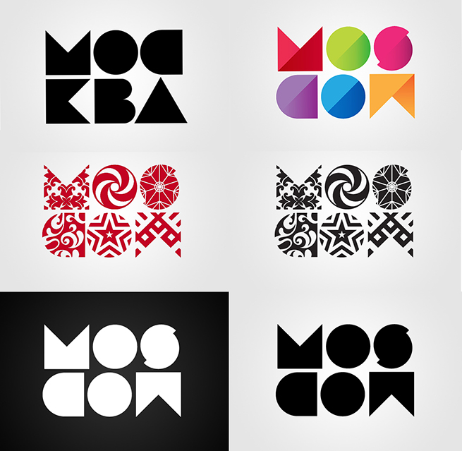
This dynamic changing style would metaphorically represents the many changing faces of Moscow. In order to achieve a strong, powerful and recognisable brand we had to nail down an element of the design that would remain constant and highly recognisable and identifiable at all times. We designed a very simple, yet differentiated and blocky typeface, with each letter become a frame of sorts, to hold different patterns and styles of colours inside. This interchanging of styles would appear dynamic, while the identity and style remained constant.
The graphic elements could then by adapted to different formats and applications creating a very vibrant yet consistent look and feel, reflecting the modern, vibrant and dynamic City of Moscow.


Unmistakeable, however you say it
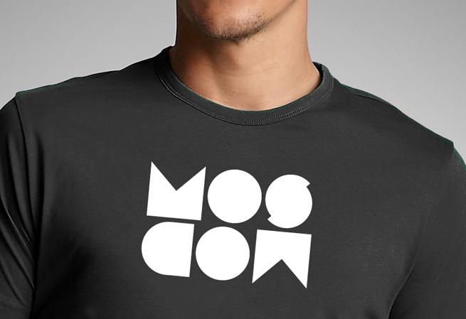
A logotype was created using a bold geometric font for the Cyrillic and Latin versions of the city’s name. The striking multicolour interpretation in both languages brings the brand to life, expressing the vibrancy, diversity and youthfulness of Moscow today. A reversed-out version of the logotype allows the letterforms to be used as windows to showcase products, cultural venues and historical buildings associated with the city in advertising campaigns.
Design guidelines were also produced to ensure consitency of application during and beyound the launch of the new identity.

