Peak performance
The region of Trentino known for the Dolomites and great skiing still has to compete with other destinations for its share of the tourism market. The development organisation Trentino Sviluppo Spa recognised the importance of building awareness of the region among tourists, as well as promoting its agricultural produce and attracting new investment opportunities to develop local enterprise. Against a changing media environment and competing destination brands, the Trentino identity had become restricted in application and outdated. The brand identity needed to work harder. The brief from Trentino Sviluppo was to evolve the existing identity to support a more powerful brand proposition.

Promoting sustainable tourism
Trentino is one of the sportiest regions in Italy, offering various activities in addition to skiing, including cycling, rock climbing, trekking and hiking, as well as water sports. Trentino Sviluppo is keen to develop sustainable tourism in the region, which means offering a select range of sporting and outdoor pastimes, cultural events and places to visit. With a small population of 500,000 compared with other regions in Italy, Trentino very much relies on tourism. The main population live in mountain villages growing fresh produce during the summer, transforming into ski instructors, hoteliers or restaurateurs in the winter to meet the demands of the many visitors to Trentino’s slopes. The mountain environment is a delicate ecosystem that needs to be managed if it is to be enjoyed by tourists in years to come. Providing support and advice for visitors, Trentino Sviluppo in confident more people can responsibly experience what the region has to offer.
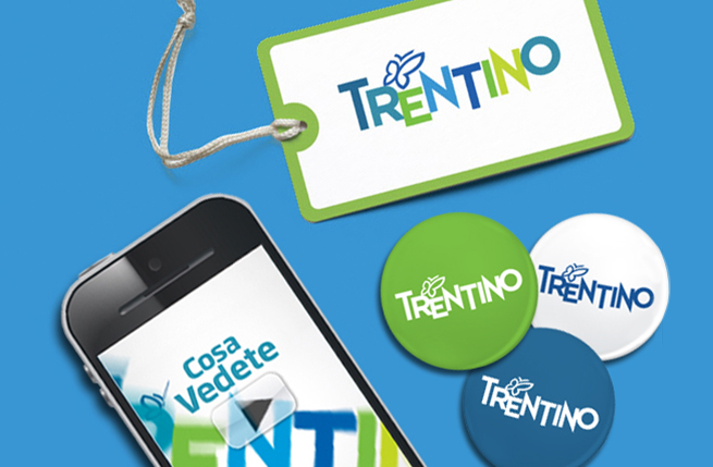
The design solution maintains the typography of the previous identity but in a livelier version, placing the letters on different levels to reflect the mountainous landscape. New colours convey the greens of the pastures and blues of the lake and skies. Since it mirrors the shape of the region, the butterfly motif has been retained from the earlier identity as part of the Trentino logotype.
Because of the number of stakeholders involved in implementing the Trentino identity, we produced a design manual for five different types of user: Trentino Svillupo, the institutional body; the APT or tourism agencies in the region’s 14 valleys promoting their particular resorts; large authorities or collective bodies in charge of transport and other infrastructure or utilities; small privately owned businesses, such as hotels and restaurants; and event organisers, whether sporting, cultural or of national or international status.


After the guidelines comes...

as well as online (all the time)...

it's about being connected...

and amplifying the message...


to engage...


and stay ahead of the game!


So whats new?

The best rebrand of a region
It is difficult to measure quantitatively the effect of a destination rebrand as differences in numbers of tourists are subject to wider market forces. Over time, however, the quality of the demographic profile of visitors is changing, encouraging more sustainable tourism that respects Trentino’s beautiful and fragile environment.
The new identity has been well received and we have been selected to work on other branding projects within the region, including the promotion of Trentodoc wines, tourism for Lake Garda and Melinda agricultural produce.
Our work rebranding the Trentino region of Italy won a Gold Transform Award in the category of Best Rebrand of a Region. The Transform Awards recognise excellence in rebranding, repositioning and brand transformation, celebrating creativity, innovation and effectiveness.