Wild about the wine
The Sassoregale winery is located in southwest Tuscany, in a wild, uncultivated wetland known as the Maremma Toscana. Probably unknown to the average tourist, this is an area which is home to local cowboys or butteri, as well as roaming wild boar amid a rugged untamed landscape.
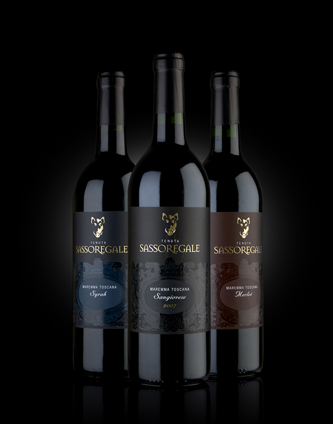
The successful, well established Italian wine producers Santa Margherita acquired the vineyards of Sassoregale to boost the mid-priced red wines in their brand portfolio. Whereas so often we are asked to re-launch, refresh and repackage brands, it was a breath of fresh air to be briefed to launch this label from scratch and position it as a strong contender in the Merlot, Syrah and Sangiovese markets. We thought the Sassoregale winery had a story that was wild, full bodied and intriguing that needed to be told.
Hogging the show
The pack design brief for the Sassoregale range was to create great shelf stand-out and convey a notion of discovery, partly because vineyards are not traditionally associated with this region. It comes as a discovery when you realise they are there at all. And, of course, Sassoregale wines are also worthy of seeking out.
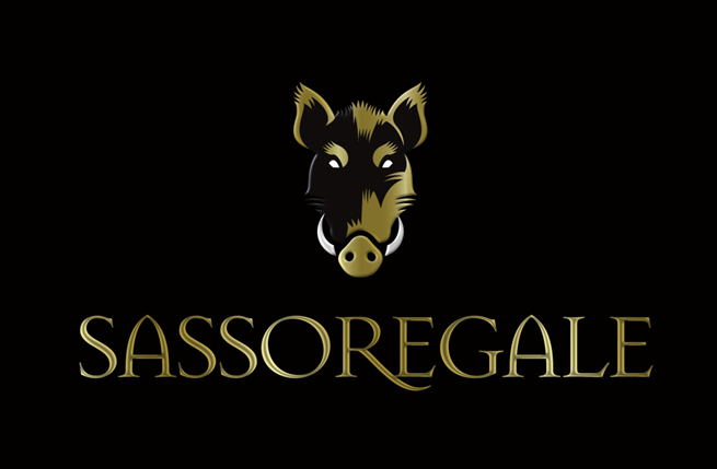
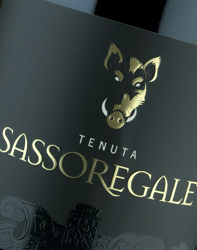
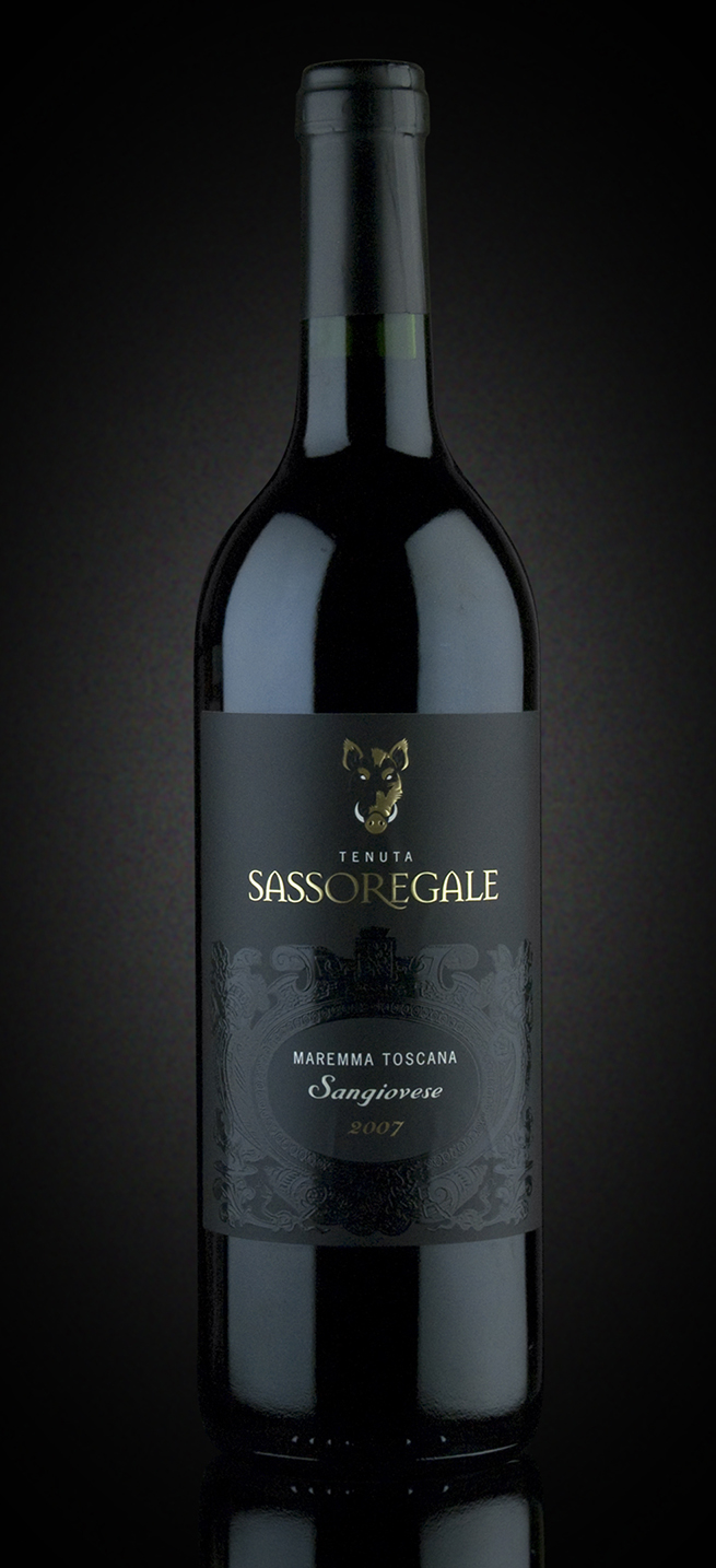
We researched the landscape around the grape-growing area to hunt down visual clues that would best express the primitive and harsh features found there. The wild boar was finally chosen to symbolise the qualities embodied by the brand because the animal commands respect and is untamed and adventurous.
A sense of discovery
We placed the specially commissioned illustration of the boar’s head above the brand name and gave it a woodcut treatment, suggesting an artisan finish perfectly in keeping with the brand identity. We embossed it in gold onto the dark matte-finish labels to create an intriguing image waiting discovery. The ornate “Canta Gloria” which the winery had previously used was given a more contemporary, stylish appeal by embossing it onto the label in the same colour as the background but in a gloss finish.