A new horizon
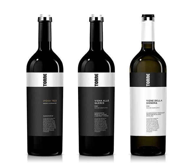
TORRE portrays San Martino’s vision of producing the most elegant and subtly sophisticated of all Romagna wines – the zenith of quality and a highly visible point of reference for well-informed customers worldwide.
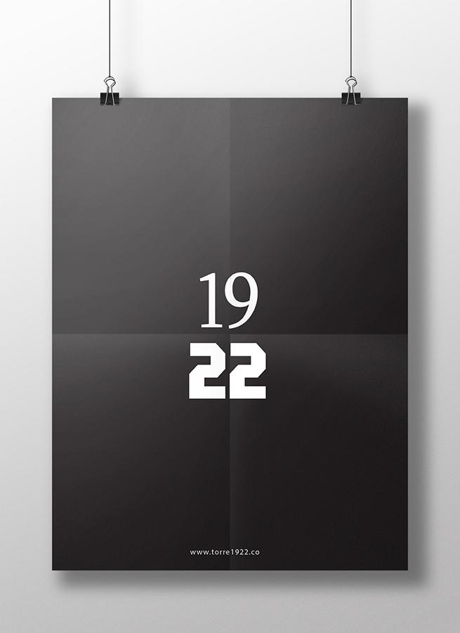
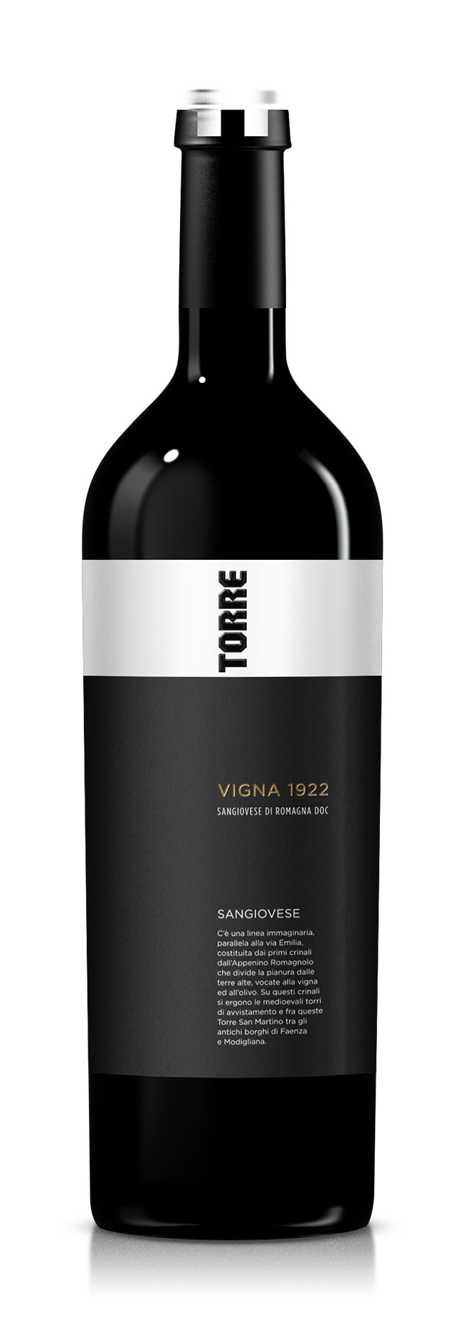
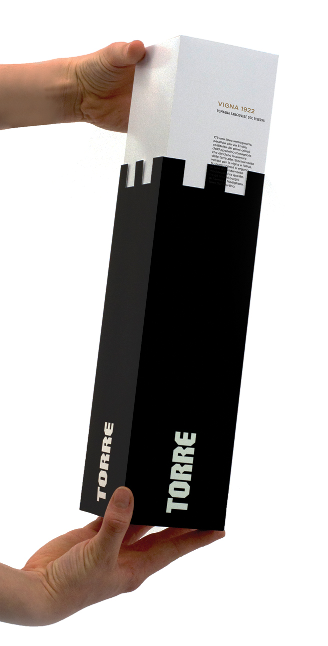
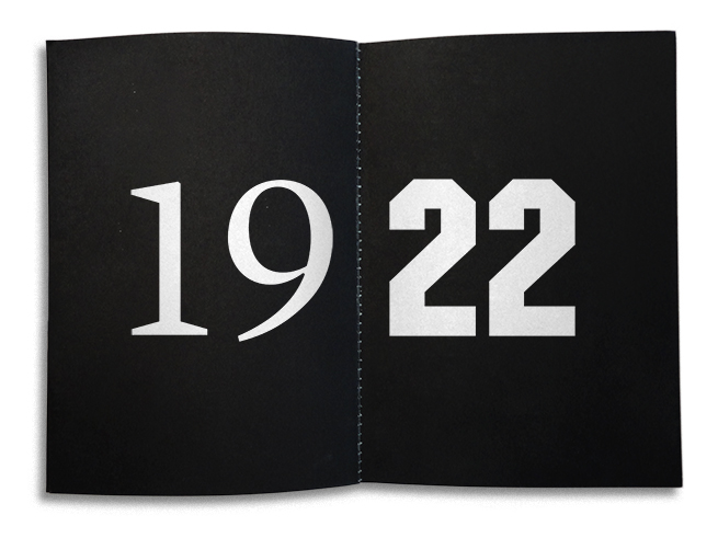
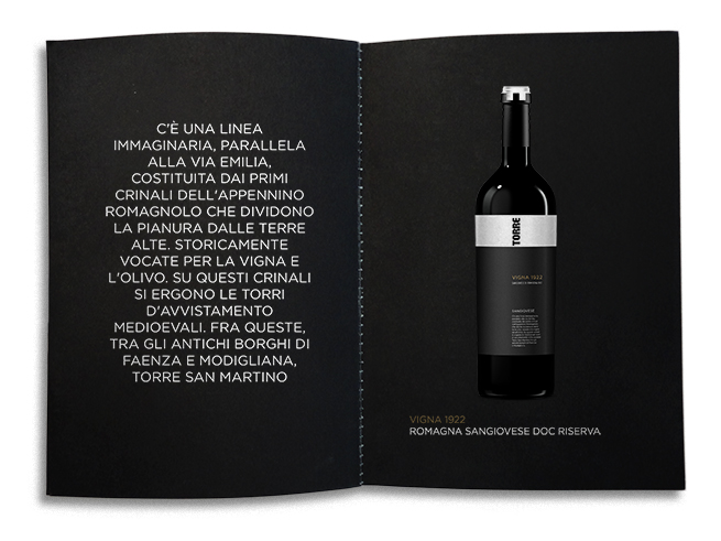
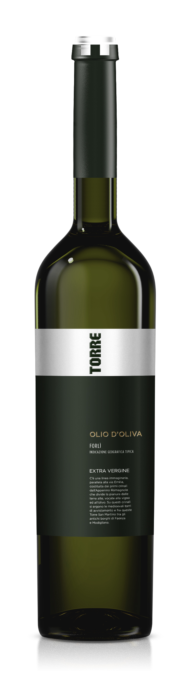
Tenimenti San Martino in Monte was launched in 2001 upon an ancient abandoned vineyard, Sangiovese, which historical research suggests to date back to 1922.
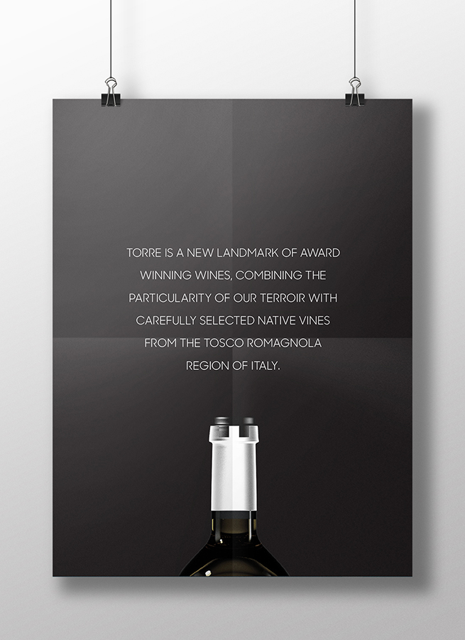
In 2012, Tenimenti San Martino required some fresh thinking and approach to reposition their wine range in the premium category. The aim was to attract high end Horeca (Hotel, Restaurant and Coffee shops) channels in the US and UK, looking for wines with something special. This meant a shift of focus from wine excellence alone to wine excellence with a compelling and exceptional narrative.
Holding the fort
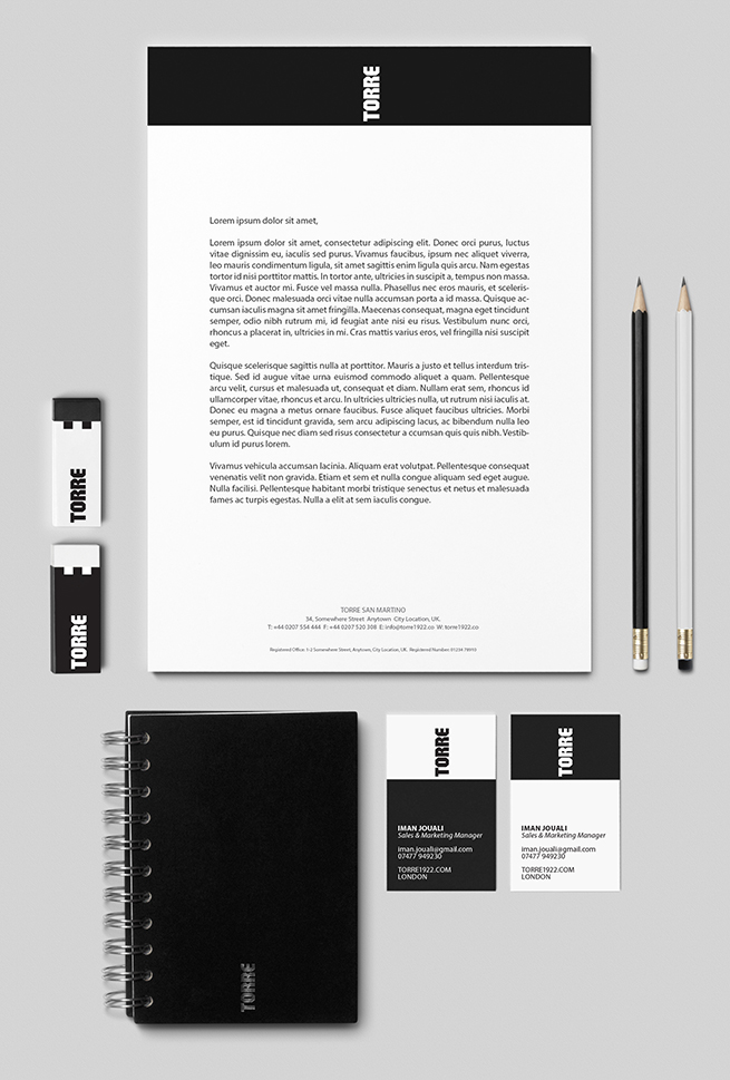
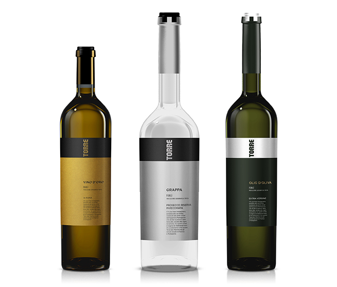
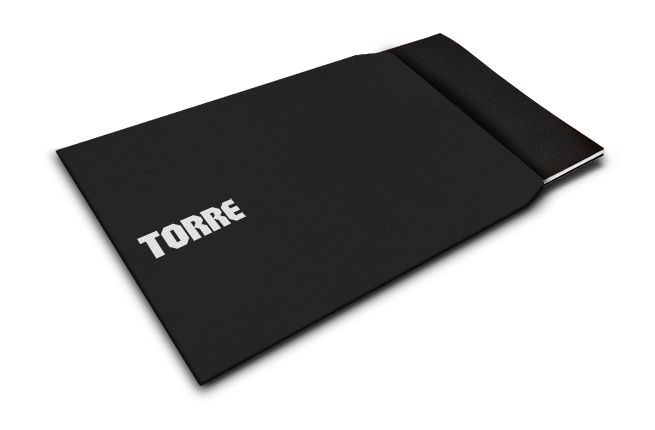
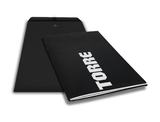
The rebranding involved applying a minimalist but impactful verbal and visual identity applied across all its bottles and supporting communications. The objective was to stimulate curiosity and interest and create a sense of exclusivity for those in the know.
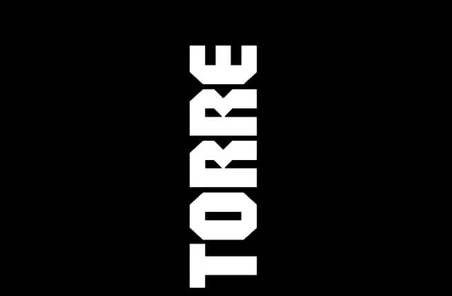
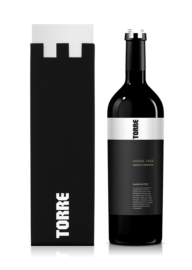
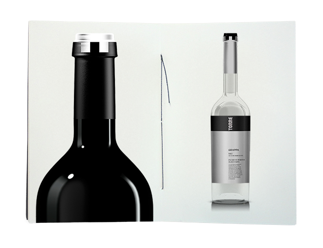
To allow a modern interpretation to come through, a new identity TORRE, (meaning Tower in Italian), was created. The simplicity in the name made for a bold and simple visual identity, that when placed vertically on the top of the wine label, made a highly visible, recognisable and memorable statement.
This tower symbology gives the winery a powerful yet subtle device to communicate what lies at the heart of everything they do, which is to produce a small exquisite range of wines that appeals to a very selective, young and highly fashionable crowd. The black tower set against the white horizon makes references to the towers of the middle ages that dominated the part of Italy where this beautiful winery is located. The associations of the towers holding a strategic position makes a compelling statement and is reinforced with the tower printed on the capsule (bottle neck).
These powerful statements and associations along with the contrast between the black and white elements of the branding, makes for a strong brand look, that in its simplicity is striking and confident and appealing to a young, sophisticated and fashionable palette.

Winning ground
The tower icon is a potent symbol of a winery that must battle hard to win the attention of HORECA businesses. Preliminary figures suggest that the brand is succeeding in this respect with the wine being listed with some of the most fashionable and stylish restaurants in London and New York.