Designer labels
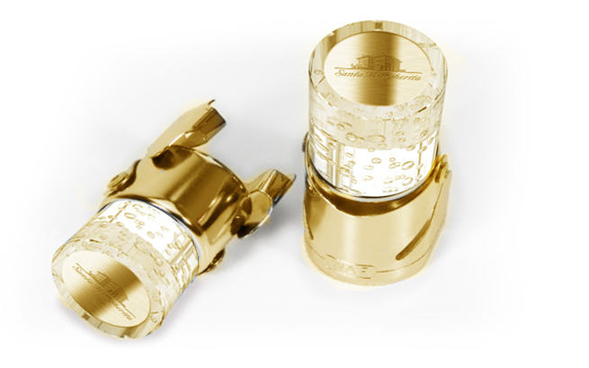
Santa Margherita wines have been produced in Italy since 1930. Still owned by the Marzotto family, the Santa Margherita group of companies has added new wines to its portfolio by acquiring small independent wine producers over the years. The mainstay of its range continues to be Pinot Grigio and Santa Margherita is one of the largest exporters of this outstandingly popular varietal to the United States, where it is a leading brand.
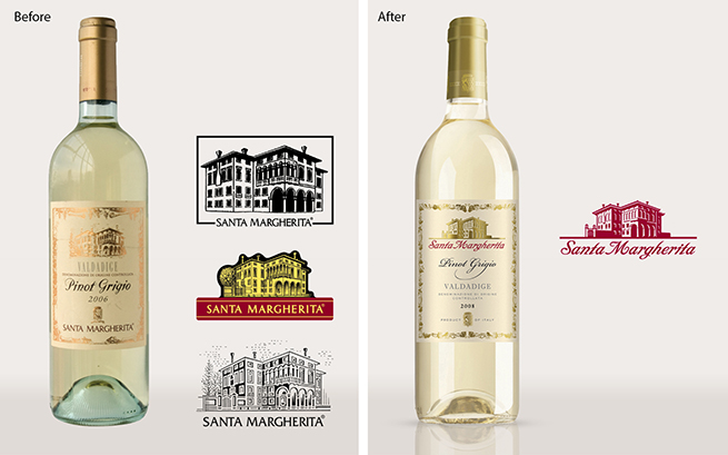
When they asked us to help them redefine their position in the market to achieve better consumer recognition, they were looking for a nicer label. Much better to build a stronger brand was our view. Senior managers at Santa Margherita told us they were ambitious for growth and had plans for further acquisitions. To be successful going forward, they realised they would need to be more strategic in their approach and create a structure where each wine would have an appropriate niche or market proposition.
The same great wine but different
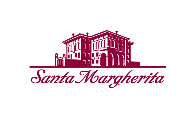
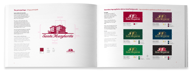
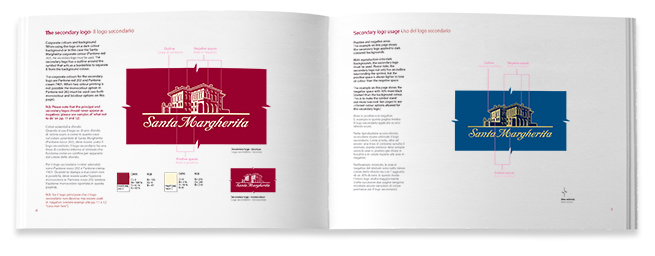
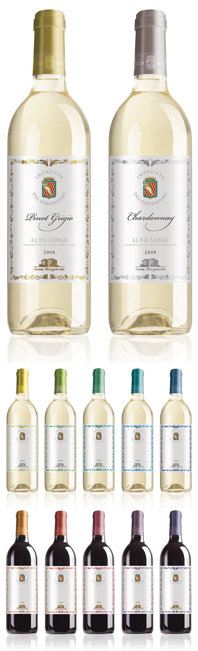
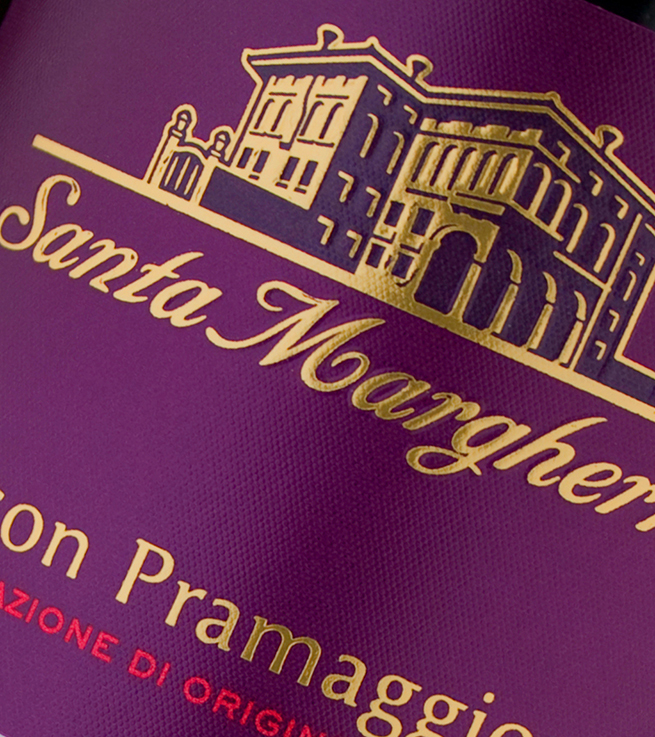
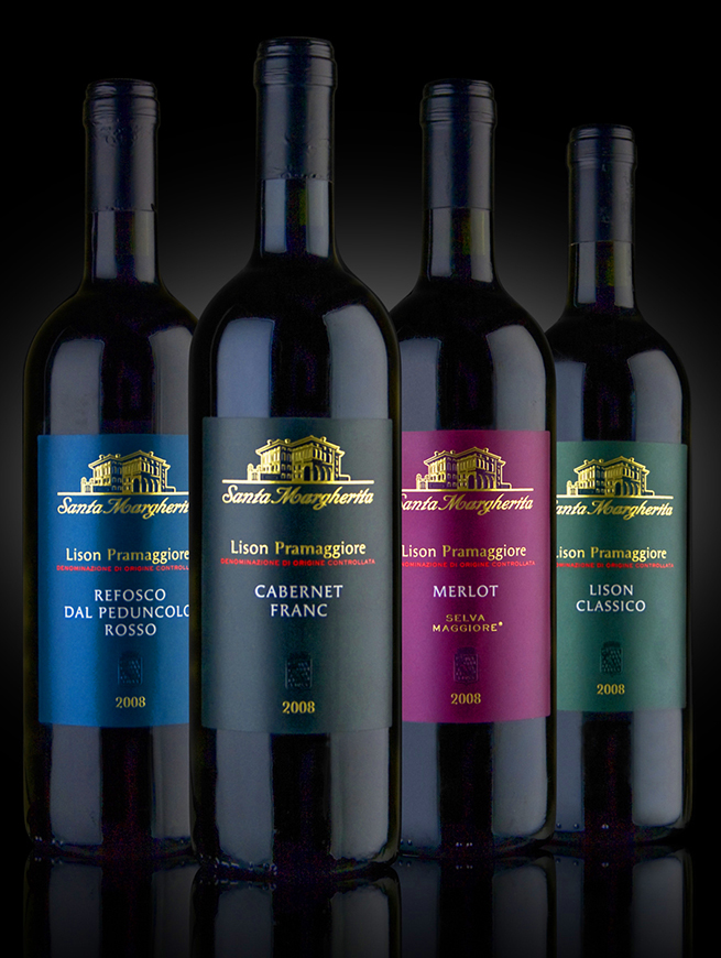
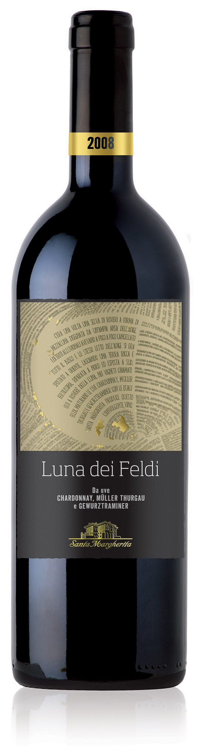
We looked at each varietal label as a design project in its own right and evaluated that particular design within the context of the Santa Margherita portfolio. We also devised a set of brand identity guidelines that could be applied to new varietals as they were added to the existing range at a later date. The iconic image of the villa, the ancestral home of the Marzotto family was redrawn to be a unifying element across each of the wines and depicted on labels along with the Santa Margherita name in an italic script.
As part of the mix, it was important not to ignore the loyal group of Pinot Grigio enthusiasts who had been buying Santa Margherita for years by making sure they would still be able to find their favourite wine.

Salut! Cheers!
Following our redesign, the brand identity of Santa Margherita was strengthened and the company’s range of products visually aligned to work for both domestic and international markets. The brand name became more highly visible and consequently better recognised. As well as retaining their existing market of buyers already familiar with the product, there was a fresh appeal to a new younger market of wine drinkers. People who were perhaps familiar with the varietal but not the brand were encouraged to try Santa Margherita.