Elki Palki was created in 1996 by Russian celebrity chef Arkady Novikov to become the first modestly priced restaurant based upon traditional Russian cuisine. However in recent years the colourful brand has looked tired in comparison to its competitors.
Minale's design strategists felt that a theatrical and witty interplay across touchpoints would not only bring cross-generational appeal but would also raise the status and credibility of the brand internationally.
Design conundrum
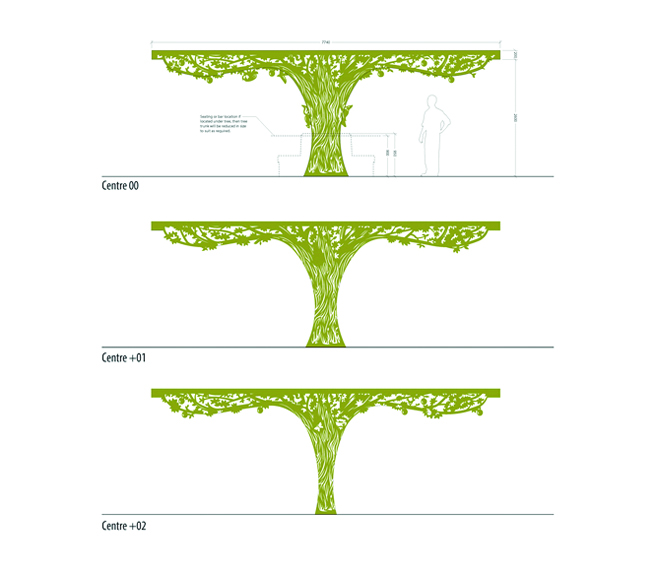
For a brand that wants to be a symbol of high quality and healthy eating, Elki Palki's former visual cues are in stark contradiction. Fake plastic trees are one of the hallmarks of the kitsch rustic venacular that runs throughout its traditionally decorated Russian taverns.
Yet high loyalty and brand awareness amongst existing visitors meant there had to be a direct link with the former design, a constraint which led Minale's design team to explore how to embrace its roots and a find a way of communicating wholesomeness without losing its quirky humour.
Focusing on a unique expression of wholesome
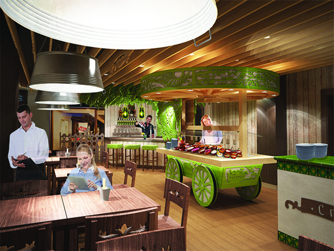
In 2012, Minale's design team were brought into completely refresh the brand identity and all customer touch points including interiors, packaging, web and advertising.
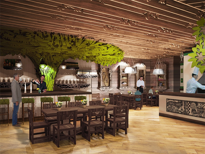
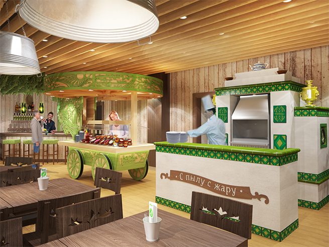
Minale Tattersfield’s work was not only to create a fresh modern brand but also to redesign the restaurant interior. A new zoning system for restaurants was developed, embedded in the food courts of shopping centers. New furniture, new design ceiling, new fresh colours in the interior.
Redefining the Russian rooster
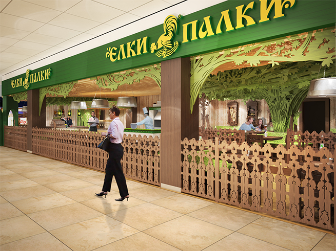
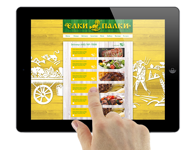
Dropping the brandname Elki Palki, a playful colloquialism which roughly translates as 'oh fiddlesticks' was out of the question. Instead the visual identity has been reimagined. So we have a swooping cockerel, completely redrawn and strippped down to its bare essentials, just 2 colours, with woodcuts referencing traditional Russian lubok.
The logo is now simpler, easier to read and perceive, and can be used in both horizontal and vertical layout - for example, on the facades of buildings.


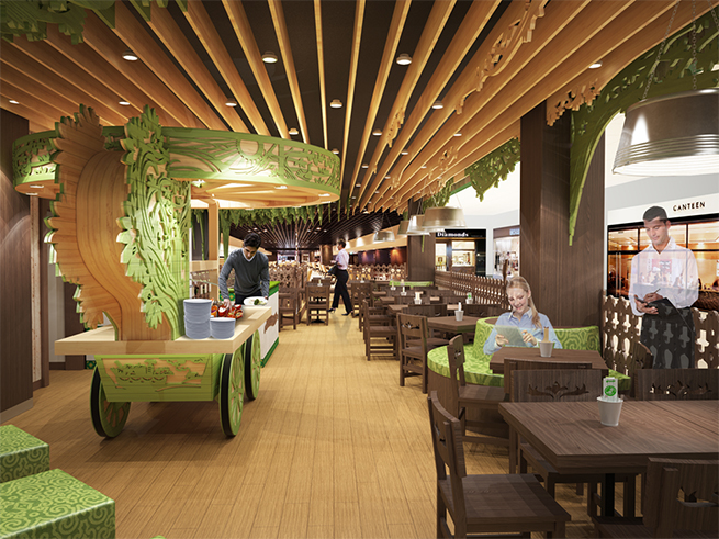


Four sites are under construction, the first of which is opening in the food court area of Domodedovo International Airport, one of Russia’s busiest airports.