
Harrods - Our first iconic brand
Created by Minale Tattersfield in 1967, the Harrods logotype and distinctive colour scheme are synonymous with this renowned luxury brand.
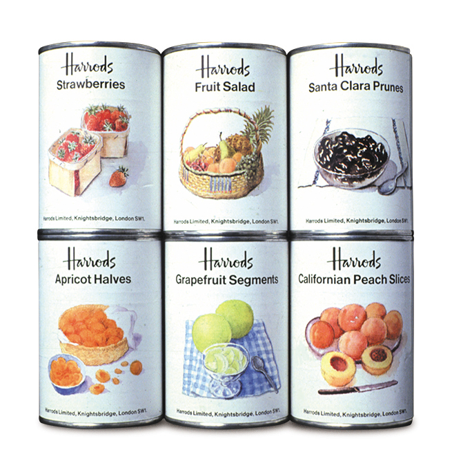
Designing a corporate house style for the Harrods department store started out with a brief to redesign all the Harrods Food Halls packaging, more than 300 products. It quickly became apparent that there were many different versions of the Harrods script used across the store’s various departments, without much consistency between them.

For the vast array of Food Halls produce, the aim was to express the individuality of each product via the pack design unified by a common style of typography under the Harrods brand.
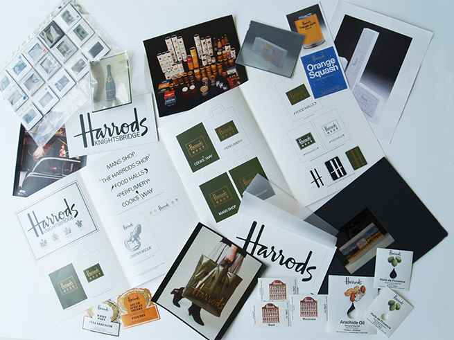
The first corporate identity brand guidelines for the new iconic identity.
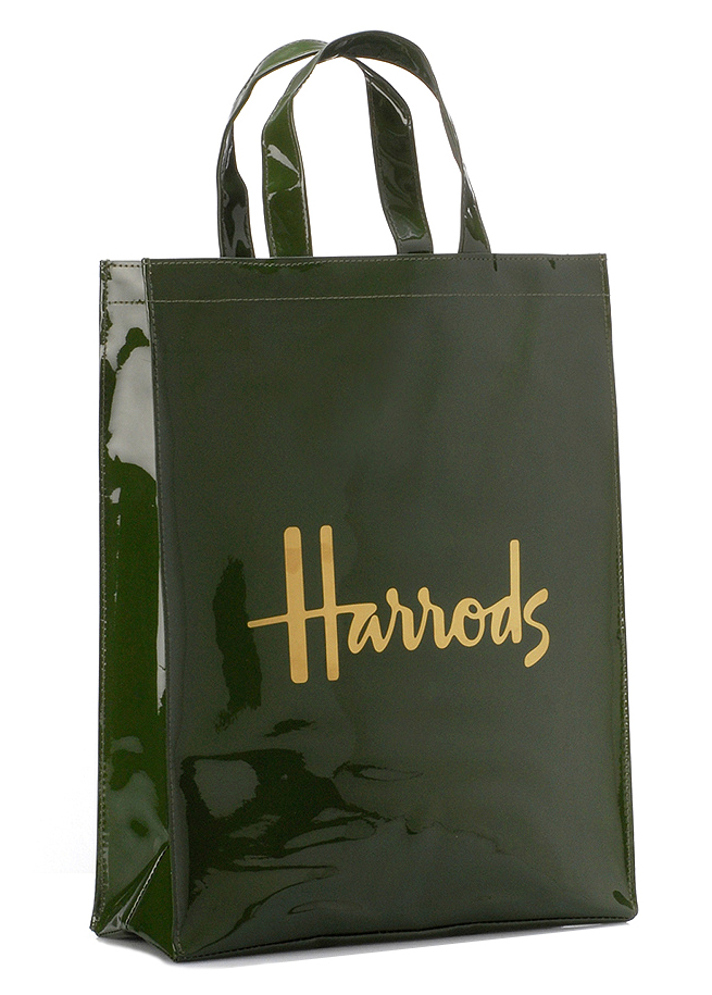
That’s how the Harrods brand identity came about, based on a signature script, hand drawn by a specialist lettering artist under the direction of Marcello Minale to create the elegant logotype so well known today. The new design was used throughout the store, identifying the Knightsbridge building and becoming a familiar sight on vehicle liveries across London, and on carrier bags. The gold and green colour palette was fine tuned, developed from a range of pre-existing but inconsistent shades, and exact specifications produced from which no deviations were permitted.
Minale Tattersfield updated the Harrods brand identity in the 1980s, adding the store’s four royal warrants and Knightsbridge location underneath the logotype, as well as a personalised Harrods typeface mimicking the signature script. An eight-page house style manual documented the designs including their use on carrier bags, vehicle livery, letterheads and packaging labels. Symbols were designed for individual departments, such as Food Halls and Perfumery, and guidance given for their use alongside the Harrods typeface.
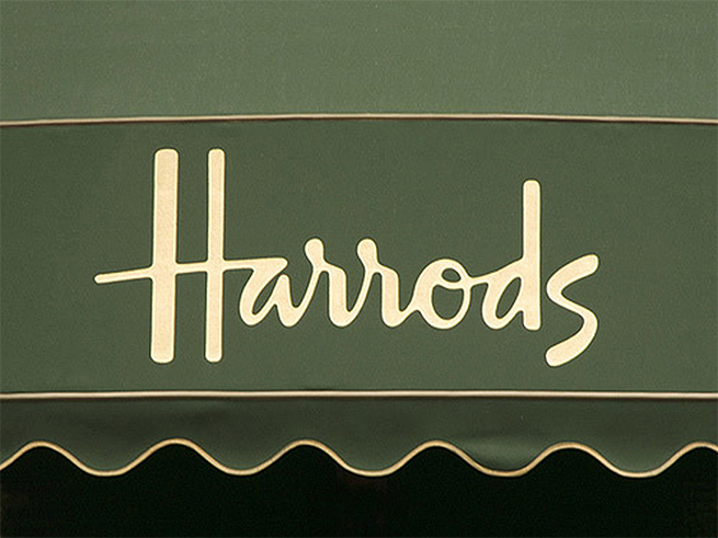
The famous Harrods signature continues to go from strength to strength, a sign of retail pedigree and enduring quality.
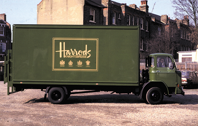
The identity post 1987 and pre Mohamed Al-Fayed, with the introduction of Knightsbridge in the logo and the inclusion of the Royal warranties.
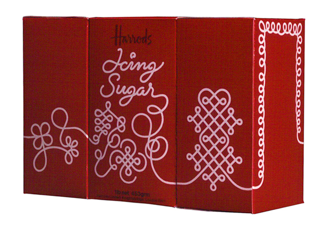
Some of the early packaging designs from 1967. Nice touch of icing on the top...
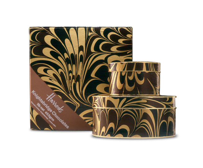
Chocolate packaging. Very 70s... reminds us of BIBA... anyone remember?
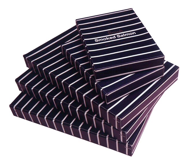
Smoked salmon anyone. Inspired by the fishmongers apron. (Design circa 1975, seems to be catching on again).
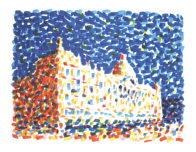
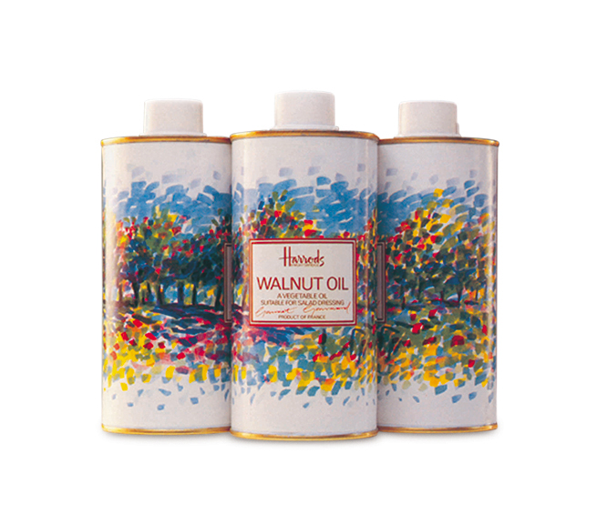
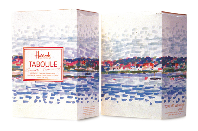
A special range of French delicacies, designed for Harrods by Brian Tattersfield circa 1986, based on French Impressionists. Can you guess which one?
comments powered by Disqus