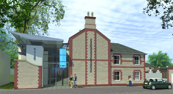
In 2007, we were invited to take part in an interior and interpretive design project for the National Horseracing Museum in Newmarket. The aim was to redevelop the existing Palace House and Palace House Stables with a refreshed exhibition.
An important heritage site for Newmarket and horseracing, the National Horseracing Museum would combine an unrivalled collection of horse racing artefacts, works of art and spectacular audio visual and interactive presentations. The challenge would be to give contemporary appeal to historical facts and figures and the display of objects.
Accessible to all
One of the most important aspects in designing an exhibition is layout and circulation developed around the narrative. Each section must relate to the next and the preceding displays for a coherent unveiling of the story, providing areas to allow visitors to reflect with no bottlenecks. The design should take account of accessibility requirements for elderly or disabled visitors, as well as ergonomic criteria for children of different ages.
Interactive technologies
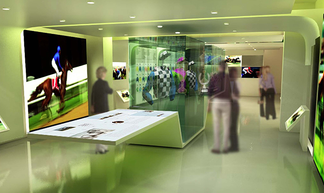
Telling stories by conveying information interactively, involving and informing people, is an entertaining way to help them learn. Interactive elements have to appeal to all ages, recognising people’s desire to drill deeper into a subject, zoom into detail and access more in-depth levels of information as well as related material.
Onscreen graphics are integrated with static displays to present a commonality and uniformity across all presentations. Embedded LCD screens show a combination of photographs, illustrations and videos related to a particular story.
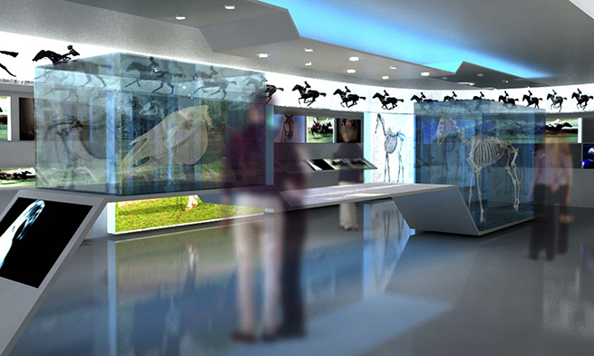
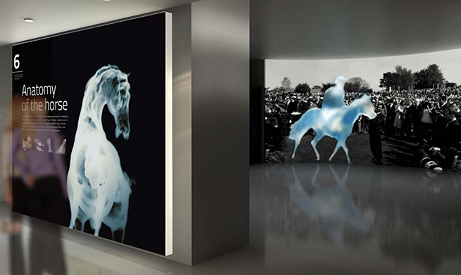
Electronic displays include an x-ray view of a horse’s anatomy; a Muybridge influenced digital animation showing horses in motion; moving images of classic races; and a simulated ride from a jockey’s perspective.
Images chosen for their impact and dynamism are combined with large scale graphics printed onto solid panels and mounted on light boxes to provide powerful backdrops for the displays.
Stable colours
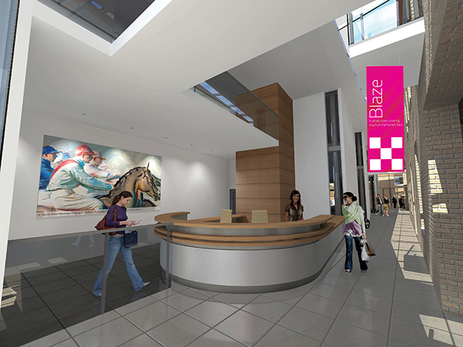
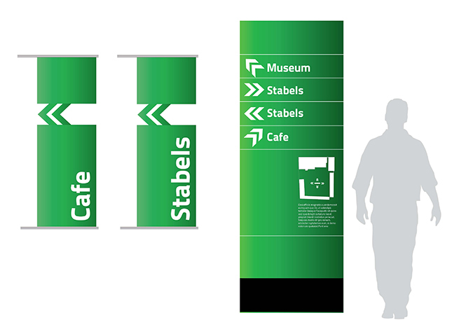
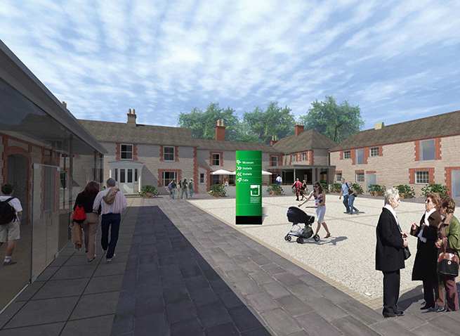
Our approach to design throughout the museum, Palace House and adjacent areas was to create a uniform, fully integrated appearance and language. The visual theme had been based on jockey silks and the colours, patterns and numbering system on saddle blankets.
Colours used in the museum graphics were bright and clear, while those for the Palace House graphics were muted and subtle. An information hierarchy was required ranging from the main information panels to labelling.
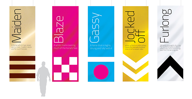
The typeface is uniform throughout and selected for clarity and suitability to meet accessibility criteria.
Ride on, ride high
The design responds to the architectural spaces, finishes and lighting and is carefully considered to enhance the displays and overall ambience. The project did not reach the finish line on this occasion; nonetheless we believe it merits inclusion as it demonstrates our multidisciplinary approach to museum design and interpretation displays.