The region of Trentino has to compete with other regions of Italy for its share of the tourist market and its share of inward commercial investment. It also needs to promote the sale of its produce and manufactured goods. Trentino felt that in order to increase their market share they needed to make the brand work harder. The existing identity had a rather cold feel to it and did not adapt well to different media.
The brief from Trentino Spa, the development organisation was to evolve the existing identity to support a more powerful brand proposition.
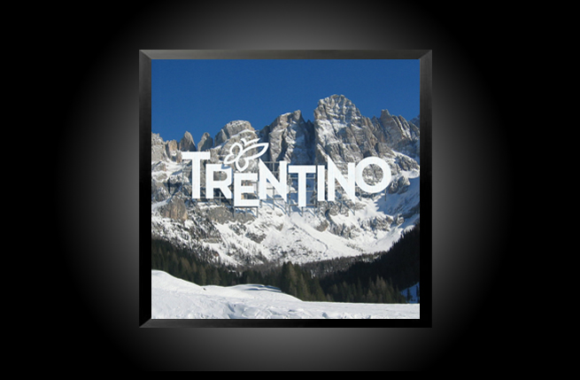
The design solution was to maintain the typography of the previous identity in order to give it a more lively appearance. Thus the letters are placed at different levels to give it a more lively appearance and to mirror the mountainous landscape. New colours are introduced to convey the greens of the pastures, the blue of the lakes and the brightness of the skies. The butterfly motif which was a feature of earlier logo was retained but placed comfortably within the Trentino name. The outline shape of the butterfly mirrors that of the region itself and in the new identity the butterfly is more stylised and lends a sense of harmony and movement.
The new identity has been extremely well received and we have also been selected to work on other branding projects within the Trentino region to promote its wines (Trentodoc), tourist hotspots (Lake Garda) and its agricultural produce (Melinda).
We continue to work with Trentino Spa to design their brand communication material. We are also working with the organisation to develop a guide to assist businesses in the region to work together and to promote themselves under the new brand umbrella.