The first branded city
In the 1960s a new city was envisaged to ease housing demand in London and offer opportunities for industries and businesses willing to relocate there. With a forecast population of 250,000, Milton Keynes had a designated area of nearly 90 square kilometres in the middle of the Buckinghamshire countryside.

The city plan for Milton Keynes was based on a grid with a central business and shopping district to supplement local community areas, instead of on a traditional town centre. Derek Walker was chief architect and planner for the Milton Keynes Development Corporation, a great man whose inspiring vision steered the early phases of the project. He appointed Minale Tattersfield to work with his team on corporate identity, graphic design, promotional material and navigational systems.

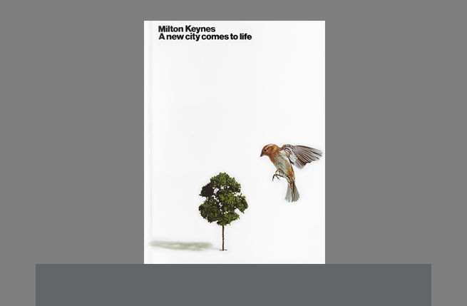
In 1972 the first project, an exhibition Milton Keynes: A New City comes to Life at the Design Centre in London’s Haymarket, helped raise awareness of the city and what it could mean for Britain, and for people coming to live and work there. Following the exhibition we developed a ten-year design strategy leading up to completion of the first phase of construction in 1992, with the final phase planned for 1997.


Alex Maranzano remembers, “We were about 20 designers working under Brian and Marcello, we had to create a brand for the entire city. We came up with a generic visual, three hands, one on top of the other, father, mother and child, and that was the main poster. We then created different identities for different areas or activities, such as housing, schools, shopping, recreation, travel and so on. For the city centre we had a neon heart – the design solutions were always relevant.”


The corporate identity for the development corporation showed the city grid with a Minoan axe at its centre, a homage to the Minoans building a new settlement at Knossos to house Ancient Crete’s increasing population. Information and navigational systems, including footpath signs and location signs for shopping and community centres, were also part of this mammoth task.

For a city not yet built, we aimed to create a sense of community to give a sense of what living and working in Milton Keynes would be like. To do that our approach centred on human beings, everyone’s hopes and aspirations, images of people, their faces and hands, everyday moments, bringing the city to life.
comments powered by Disqus